Table of Contents
Open Table of Contents
25 Years in Space
November 2, 2025 marks the 25th anniversary of continuous human presence onboard the International Space Station (ISS). My collaborator, David Charney, and I thought it would be cool to show the world each and every moment onboard.
ISS in Real Time is a multimedia project that plays back all 9,131 days (and counting) onboard the ISS since it was first occupied. We achieve this using the very data and content that NASA has been releasing for all these years, but we present it in a unique way by placing everything back into the context of the mission as events unfolded.
The term “multimedia” has fallen by the wayside, but it’s an apt description of what this is. If ISS in Real Time were a CD-ROM (the original multimedia format from the 1990s), it would be 3,846 CDs in size and growing.
A few years ago, I built (along with a team of collaborators that includes Dave) Apollo in Real Time, which operates on a similar concept. Apollo missions with their analog tapes and physical film are much less cooperative when being turned into cohesive digital experiences than the ISS mission is. That said, the ISS mission has produced several orders of magnitude more data than Apollo did, and even though much of it is natively digital, getting the data to “cooperate” has been non-trivial. More details on our data wrangling are in the sections below.
The Internet and its supporting technologies are just mature enough now to enable a project like this. Also, AI models are just now available that can do things like transcribe and translate audio and provide new ways to make up for poor historical metadata. Now is the time.
Interactivity Challenges
In the 1990s, I had the idea of making a multimedia Apollo mission but had no idea how I could make an interactive timeline that was 10 days long (the length of the Apollo 11 mission). I was mentally stuck on that roadblock and allowed myself to be stuck on it every time I thought about the idea for many years. Once I finally made a start, the act of just working on the problem instead of thinking about it unstuck me. To make an interactive experience about the whole history of the ISS was a ridiculous proposition and I was mentally stuck for a long time. Why was I even thinking about it? Not only would I never find or be able to process that much mission data, even if I did, how could I make an interface that let you explore such a vast amount of time? Once Dave and I got a feel for what kind of ISS mission data was publicly available and saw that there was a possible way forward, the project itself demanded to be made. We began donating our personal time to this project in November 2024.
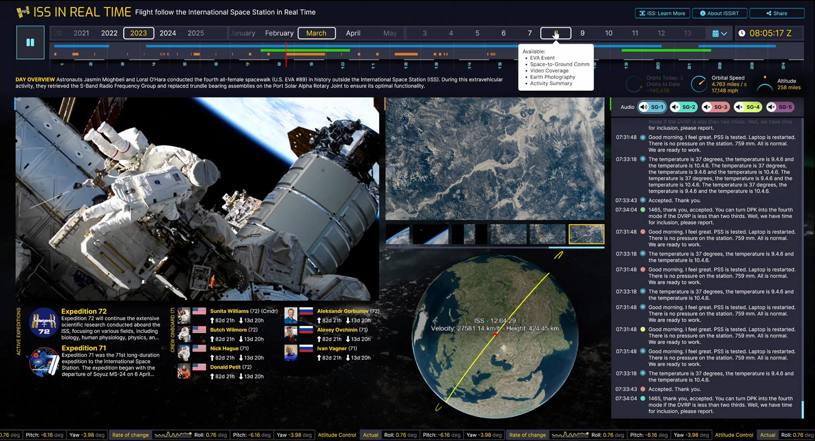
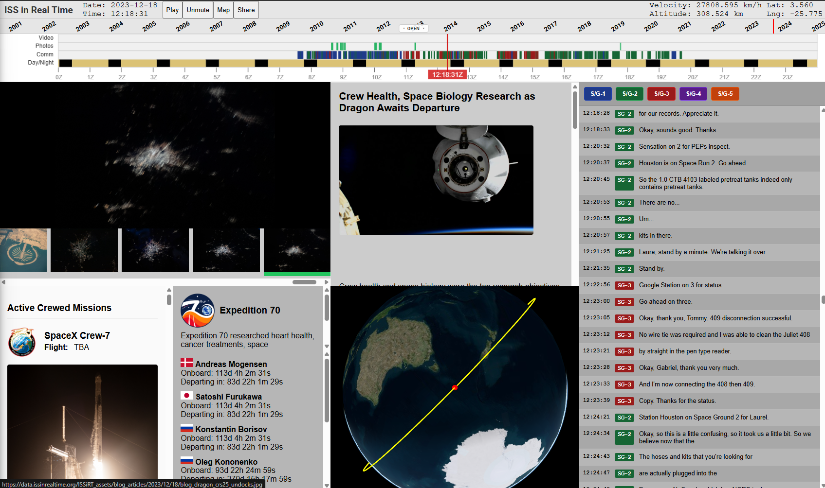
Playing back each day
The core concept of this project is that each day onboard the ISS can be played back. If a photo is taken at a given moment, it appears at that moment. The same applies to words spoken in comm transmissions, ISS orbital data, videos, etc. The challenge is that every day on the ISS has different data available. For all of these years, NASA has been releasing material in a press-release sort of way rather than producing a consistent stream of content. This happened naturally due to demands from the public and media outlets, and it changed significantly over the years. The material being uneven and inconsistent meant that we would have to find a way to present every day with potentially wildly different content available. It was clear that days with lots of content would be cool after Dave made some excellent design concepts that illustrated days with best-case-scenario data availability. We had to make this thing.
 Early day playback design concept. I love this one; it reminds me of Winamp.
 More of a standard box layout concept.
 Fluid layout concept that ties components together.
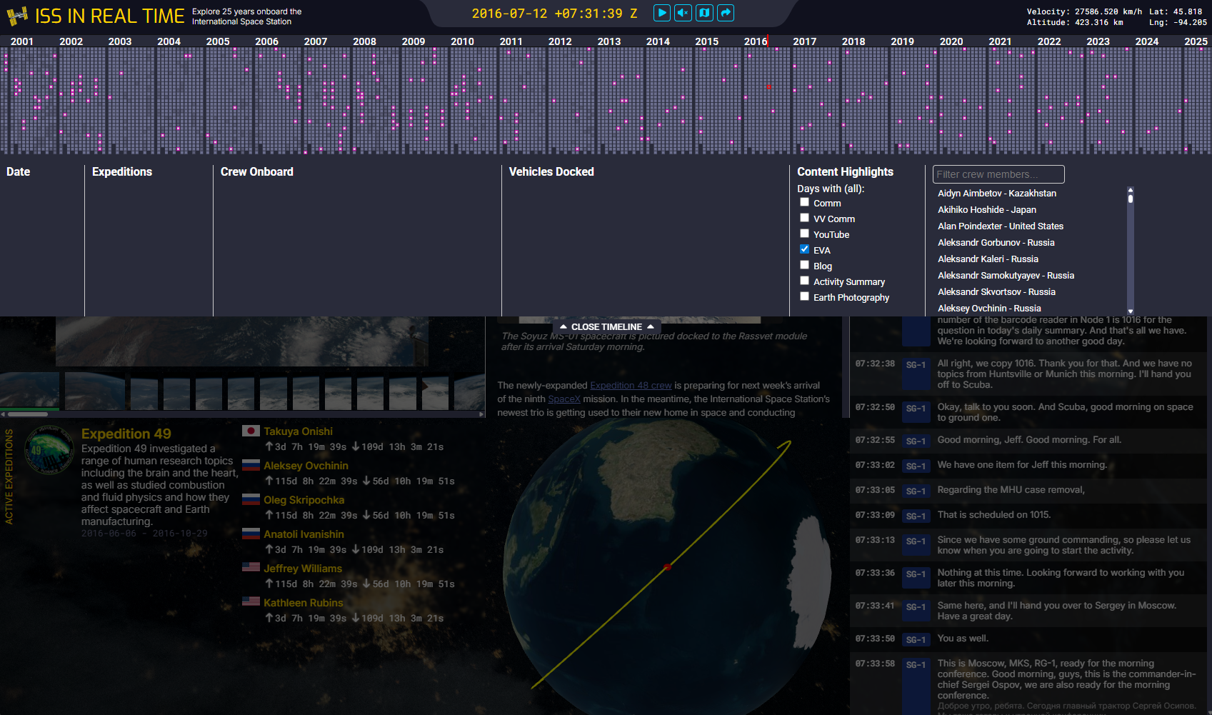
Navigating through 25 years of data
When I first conceived of this project, I was focused on the idea that we could play back any given day. Make a playhead run through every second of the day and let events unfold as they occurred. Of course this meant that the user would first have to pick a day to play back. The obvious “web” thing to do would be to use a calendar picker like the ones we see every day across the internet. But as we prototyped concepts for the day playback, we realized that the days ran into each other (of course) and the more interesting idea seemed to be about illustrating the astounding scale of the ISS program via the days running together.
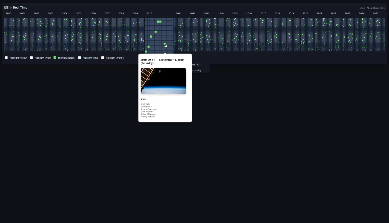
With this idea in mind, I made a prototype that played with the idea of showing the user what data is available across the days and years in a single timeline. To see what 25 years of days even looks like, I made an interface that showed a small dot for each day. Months were on the x axis, and days on the y axis. This was interesting visually, and Dave made design concepts based on the prototype to think about how we could make picking days interesting beyond using a date picker. The resulting navigation lets you move your mouse over a vast amount of time, getting a feel for who was onboard over weeks and months, what vehicles were coming and going, etc. Picking a particular day became a way to zoom into this overall 25-year-long timeline. A very broad and very deep rabbit hole.
 Dots for days. First implementation concept that shows 25 years all at once. Different dot styles try to indicate data availability for each day.
At the same time, Dave and I were concerned that users might be confused by this completely alien way to pick a date and not understand that the dots represented days. We tried a few different concepts that numbered the days, but there was something compelling about the original dots concept. Maybe it’s okay if users don’t get it right away. They’ll roll over that huge range of time, see the dates change, and hopefully the idea will click. In the process, they’ll be rewarded for the interaction.
 Design exploration of making the dots actual calendar numbers. We decided against this more literal calendar in favor of the compact dots representation.
 Another more literal calendar date picker design concept.
Rapid Prototyping
Dave and I have worked together for years, both inside and outside NASA on many projects. The bridge between designs and development, or even visual designs and interactive “feel,” has always been an industry challenge. On this project and for the first time, Dave utilized AI-assisted coding to test out interaction ideas. This was part of his design process rather than an implementation step. It was throwaway code, but it worked well enough that we could answer “but does it feel right” kind of questions before I went ahead with the actual technical implementation. This worked incredibly well.
 Working timeline prototype that Dave made with AI coding assistance to test out an interaction concept.
The Data Pipeline
With designs and the overall concept coming together, I couldn’t get too excited about the interactive interface implementation challenges until I had gathered a huge amount of mission material. What was I going to have that I could make interactive?
Over the past 25 years, NASA has continuously released data from the ISS Program in various formats and media types. In the time ISS has been occupied, the NASA.gov website has undergone many redesigns, and the landscape of digital media availability has gone from dial-up to broadband. I have made every effort to gather ISS data and media from every public resource available and used every trick in the book to figure out when everything occurred in order to place it all back into the context of the mission. This means that many days are chock-full of information, and other days are somewhat empty. Of course, every actual day onboard the ISS was chock-full; it’s a matter of whether information was made available to the public, and whether that data has survived 25 years of the Internet evolving. There are few other multimedia projects that attempt to represent data from the “early” Internet and the modern web all at once. Coverage is spotty at times. If you know of ISS data that’s publicly available that we could include, please let me know.
Data Rules
When discovering and converting data, I set a rule: no manual data cleanup. If I started massaging data here and there, I would be caught in an endless editing task. I had to come up with data scraping and processing pipelines that take whatever source data I could find and convert it into something I can display interactively.
Another rule: no server-side processing. Given the enormous amount of data involved, I didn’t want to deal with the hosting infrastructure that would be required if I were to process data on the server-side as part of the architecture. This meant the app had to be a single-page application (SPA) that loaded only static data that came out of my data processing pipeline.
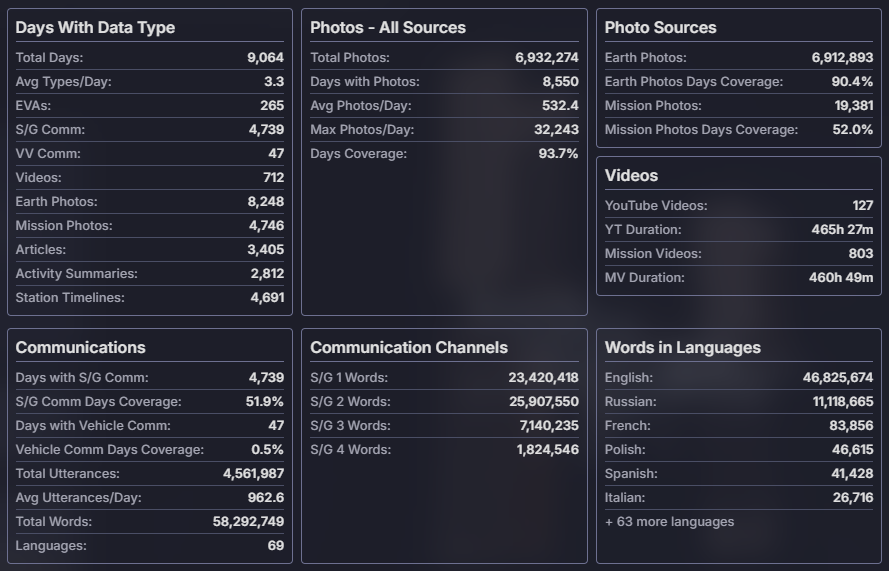 Statistics of data gathered as of launch.
See Data Details below for a more detailed description of what it took to gather and process all of the mission data.
Bringing it all together
Dave and I work in a way contrary to how most design and development is done throughout the industry. Implementation isn’t a step after design in our case. Our efforts overlap by about 75 percent if you were to put them on a timeline. Dave inspires me with design concepts, I build stuff, he looks at what I’ve made and that gives him new ideas, more designs are made, and so on. It’s a true collaboration. We make each other better, far better than if design had to be finished before development started. That said, there is a time where the “omg I have to make this thing now” phase starts, and on this project that was a steep hill to climb.
The first step was to make a layout system that could make the most of the screen space depending on each day’s content. I wasn’t about to make 9,131 different day layouts, so I had to come up with a system. The data pipelines resulted in 32 possible permutations, so I went ahead and made a layout engine that would select a specific layout based on each day’s unique combination of available data.
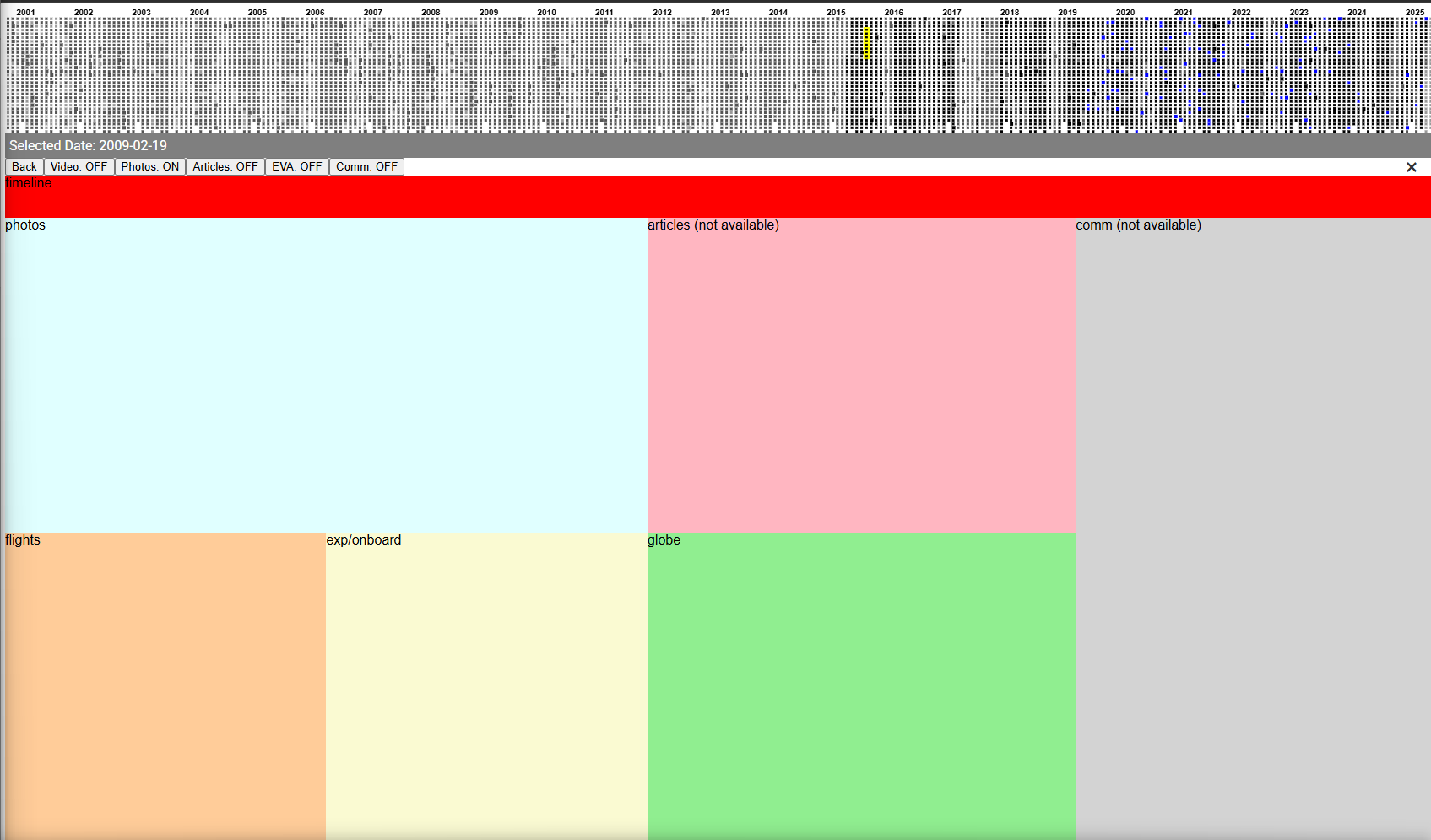 Blocking out content based on data availability.
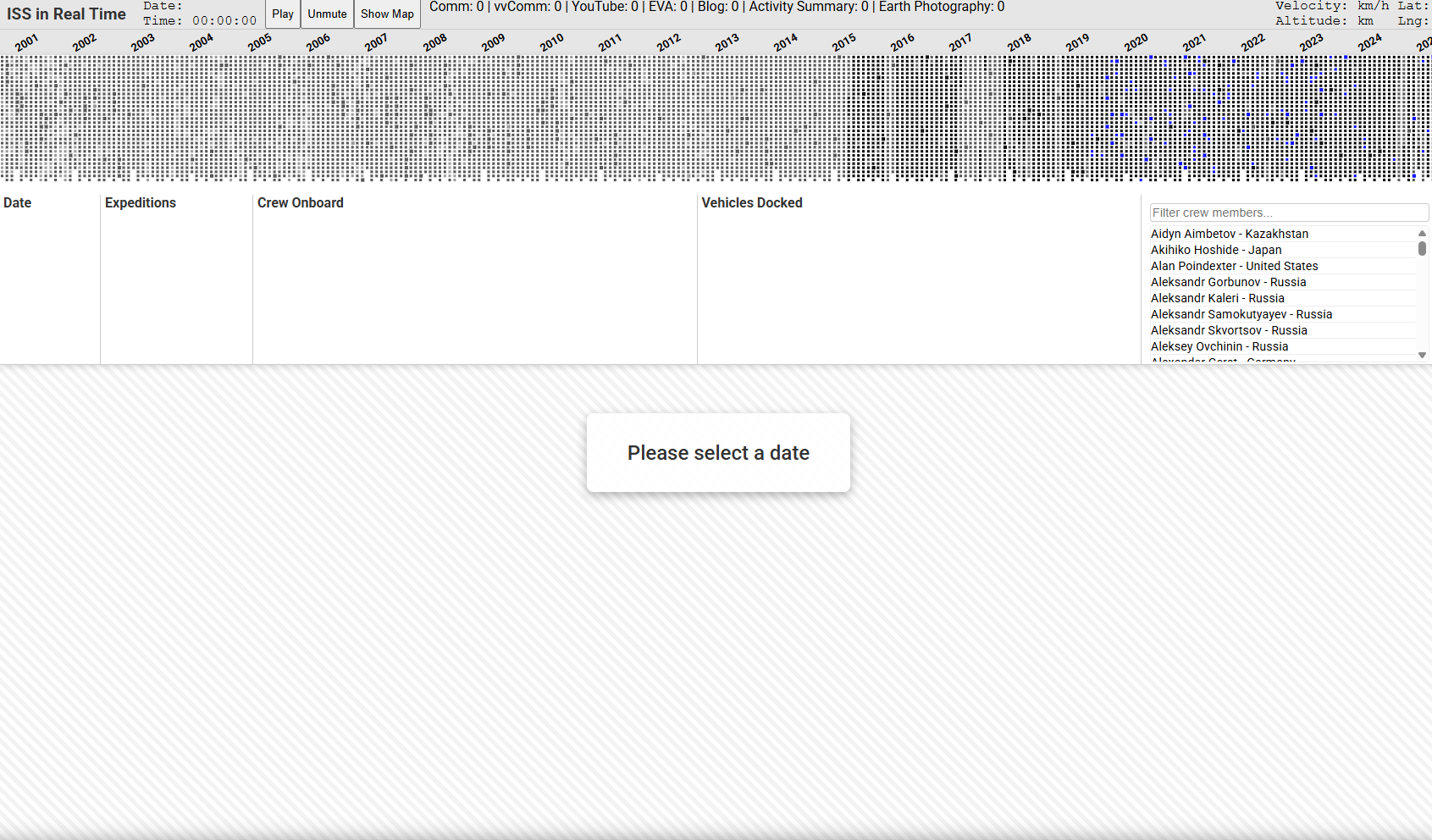
The next challenge was to prove that I could make a day playback system that used the pipeline output. I didn’t want to implement any of the design concepts yet. First, I wanted to know how this was going to work and feel to the user. At first, I wanted a simple per-data-type layout system that had a component for each data type and focused on days with plenty of data. It worked!
 Early technical prototype that could play any day onboard.
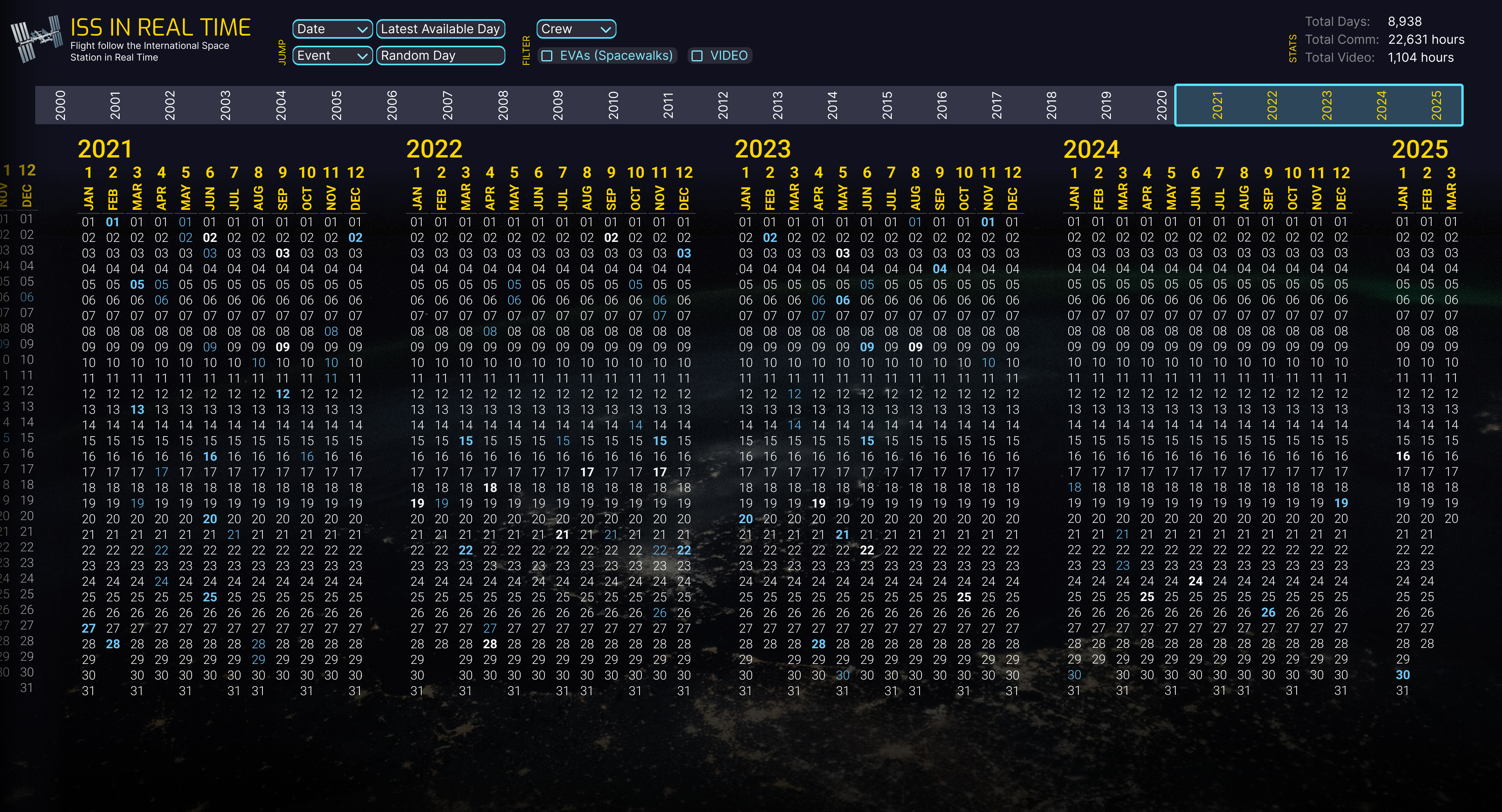
Years timeline as dropdown
The day layout system showed that we wouldn’t have enough space to leave the dots calendar system visible at all times. Between that and each day’s timeline, half of the screen was taken up. It seems obvious now, but it took a while to decide how we could make the dots calendar a full-width dropdown that used minimal vertical space when collapsed. As I began to implement Dave’s designs into the working design-less app, we switched to this dropdown idea. Unexpectedly, this really upped the feeling of the connectedness of each day. With the dropdown, each day’s events clearly unfolded in the context of the full 25-year history of the ISS. It felt great.
 The first exploration of the days timeline as a dropdown.
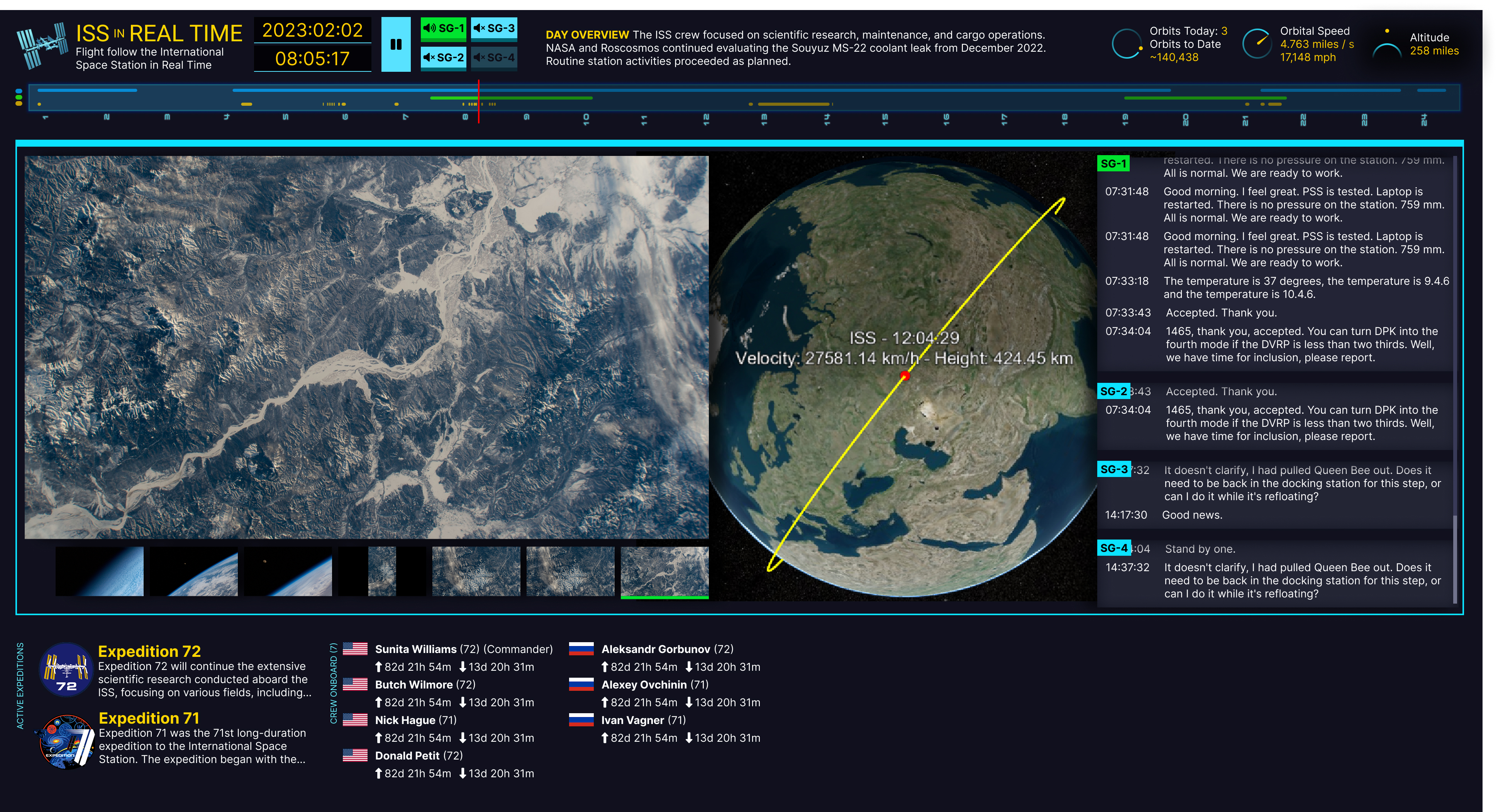
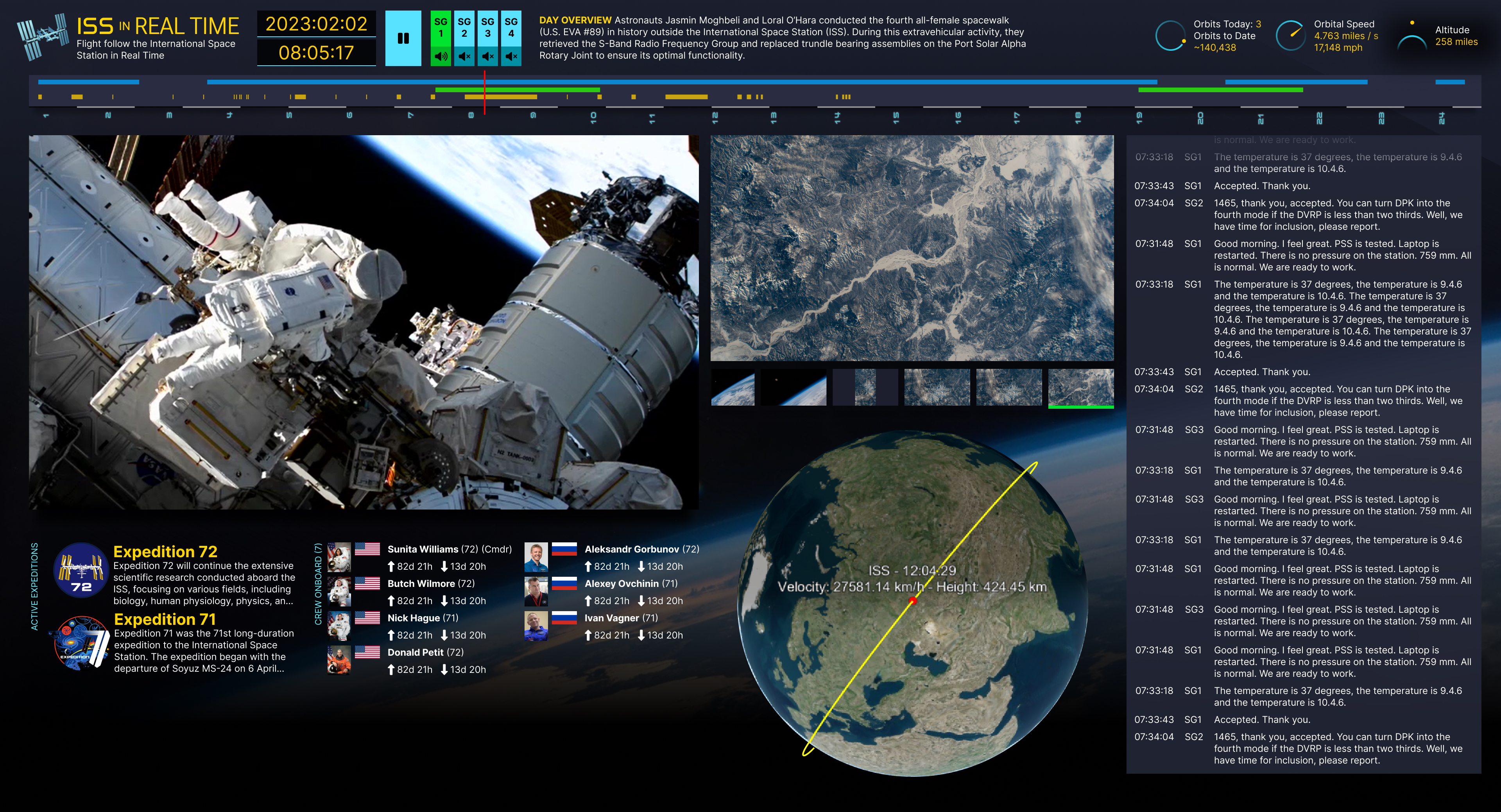
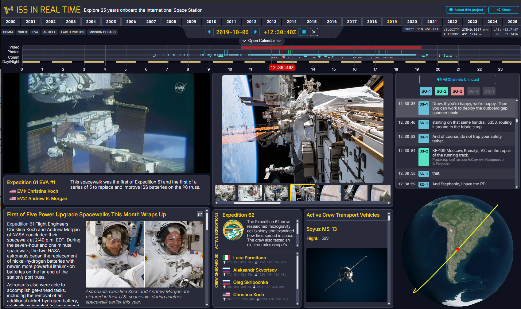 The nearly completed interface playing back an EVA.
25th Anniversary of Continuous Human Presence in Space
The result of all of this work over 11 months of evenings and weekends is live in time for the 25th anniversary of continuous human presence in space (Nov 2, 2025). One awesome detail is that because the app has all of the days connected together, it will run for 25 years if played in real time. See you all at the 50th anniversary when you’re done watching it all. (https://issinrealtime.org)
Data Details
Articles
NASA has published information about current events on the ISS (and Shuttle missions servicing the ISS) for many years in different formats from status reports to blog posts. I have pulled the full record of these articles from NASA.gov. Later in my search I discovered that NASA used to also publish the daily crew itinerary as a PDF on NASA.gov until about 2014.
At some point after 2014, NASA.gov was redesigned and a huge amount of historical material was deleted. Thank goodness for the Wayback Machine at the Internet Archive. I was able to use their API to pull all of the itineraries and many articles and blog posts published to NASA.gov before 2014. All are included within each day using the publication dates.
Visiting Vehicles
The ISS has had a constant stream of vehicles docking and undocking, including crew vehicles and uncrewed resupply vehicles. I used the data published on Wikipedia to catalog these. This information is provided for every day.
Crew Members
Lists of crew members who arrived and departed from the ISS on different spacecraft were also gathered from Wikipedia. This allowed me to derive who is onboard at a given time. This information is provided for every day.
Expeditions
NASA broke up the work being done on the ISS by expedition. Counterintuitively, there were often multiple expeditions active on the ISS at the same time. The information about which Expeditions are active at a given time was gathered from the NASA.gov expedition list. The summary text that describes each expedition was also pulled from NASA.gov.
Space-to-Ground Communications
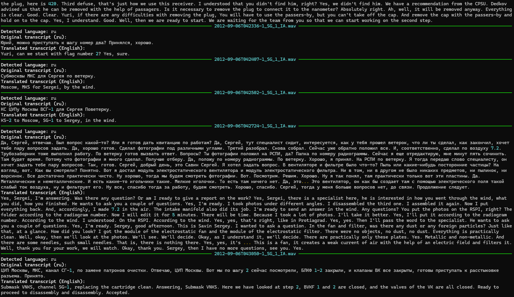
The ISS has four space-to-ground communication channels that they use to stay in touch with Mission Control at Johnson Space Center in Houston. Every day’s comm from the ISS is published to archive.org by the NASA public affairs office. I gathered all of this material (currently roughly 4,800 days of audio) and broke it down into transcribed and translated units of speech I call “utterances.” A few of the days onboard include dragon-to-ground (or air-to-ground in the case of the Boeing Starliner) communication. I have treated this in the same way as space-to-ground and include it in the context of when it occurred.
WhisperX transcription pipeline
I used the OpenAI model called Whisper Large-v3 to transcribe each utterance. This AI model includes the ability to translate from other languages, so I translated any non-English comm to include the original language and the English translation.
The recorded historical audio has already been segmented by the NASA Public Affairs Office (PAO) with large amounts of silence being removed, but the resulting wav files can often be over an hour long if there’s unbroken chatter like on an EVA day, or if there’s a large amount of noise on the line (which often seems to be the case when talking to Moscow).
Whisper’s transcription model can take an initial_prompt, a very short amount of text that lets you put your thumb on the scale (turns out not too much) to get the model to be more accurate at transcription, especially if there are technical words which, in our case, are very frequent. Given that this is historical audio, I decided to see if I could use the other data I had gathered about each day to produce a unique initial_prompt for each day. I used the qwen3:14b LLM to read all of the articles, status reports, list of crew members onboard, etc. and to boil it down into a 250-character prompt. The result is unique for every day and looks something like this:
Huntsville, Houston, Moscow, Tsukuba, Munich, space-to-ground, Radio Procedure Language, Satoshi, Andrei, Aleksandr, Sergey, Michael, Ronald, MPLM-1, JEM, CIR, TDRS, EVA, Node 1, telemetry, S-band, Ku-band, docking, resupply, combustion, rack
(2011-07-04)
My processing pipeline sends the raw segmented PAO wave audio straight to the Whisper model with some additional alignment handling that results in transcripts with word-level timestamps. In my measurements, alignment takes less than 5% of the total processing cycle. I use the word-level timestamps to detect pauses and sentence completion to parse the spoken audio into utterances. From here, I construct a complex ffmpeg command that directly cuts the original WAV file into utterance AAC audio files in a single step, one AAC for each utterance.
I was able to transcribe about three months of comm every 24 hours on my home computer (5950x, RTX 4090). Including false starts and iteration while developing this process, my computer ran for months to generate the transcripts.
Screenshot of the transcription processing underway.
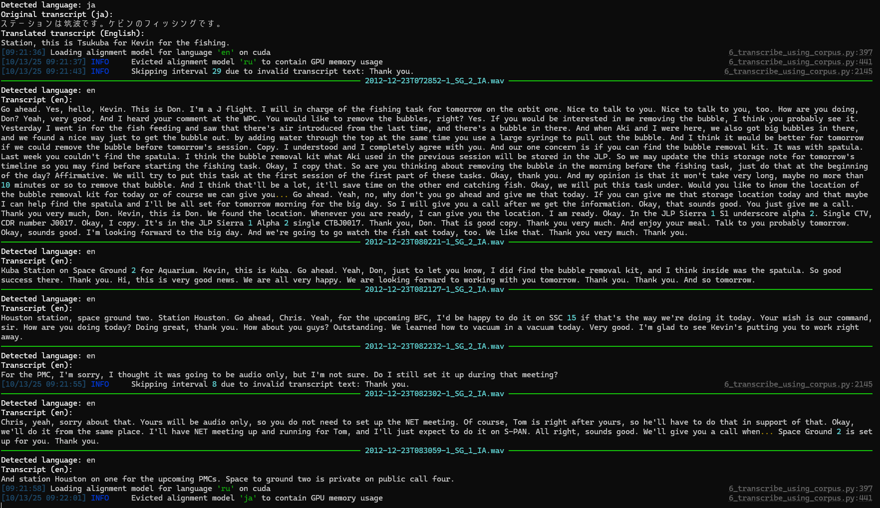
Screenshot of the transcription process including translation.
Orbital Ephemera
NORAD tracks the ISS and publishes its trajectory data multiple times a day. The ISS’s orbit is constantly changing. The orbit is low enough that there’s still a small amount of atmospheric drag that changes based on the orientation of the ISS, its solar panels, etc. The ISS is reboosted at different intervals in order to stay in orbit. This makes the calculation of orbits quite complex, but using the daily tracking state vectors published every day we are able to show where the ISS has been over the past 25 years, including the number of orbits it has made since the beginning of its construction. The data I use was sourced at spacetrack.com.
Earth Photography
NASA’s ongoing Earth Observation efforts include an excellent online database of photos of the Earth taken from the ISS. This is the only active public repository of data that I found at NASA, and it contains millions of photos; it even includes a helpful API. I used this API to collect information on each photo, such as when it was taken, so I could place it back into context. Of course, I only know when each photo was taken based on the clock within the cameras used. These clocks sometimes drift out of sync with Earth time when in space. NASA has included in their photo API additional data about some of the photos that includes the geographic coordinate bounds of each photo. They did this using a machine learning model to locate each photo. Photos with this extra data are placed on the website globe or map as they are taken. Grey boxes represent the previous and next photos, and yellow boxes mark the current photo. I wonder if this data, plus the photo’s possibly incorrect timestamp, could be used along with the ephemeris data to correct each timestamp. I’ll leave that for another day.
Mission Photography
NASA PAO has been publishing photos to Flickr, including data from each photo about what time it was taken (again, assuming correct clocks). I gathered this data from Flickr and then wrote a custom AI agent using gpt-oss:20b that helped me identify which photos were taken in space by reading the photo description copy. This filtered out training and other press photos that were in the same Flickr collections as flight photos. Using AI for this sure beats manually sorting 60,000+ photos, but the odd miscategorized photo may have slipped through.
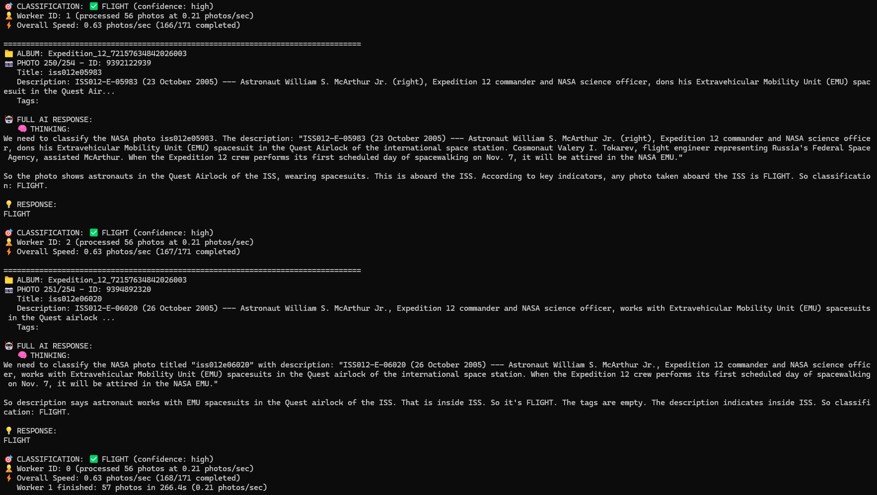
gpt-oss:20b powered AI agent helping to categorize Flickr photos as “FLIGHT” vs “ANCILLARY” based on photo description text.
Video
NASA PAO releases clips of video as they are requested by the press, etc. onto archive.org. I gathered all of this media and used identifying information that allowed me to determine the start time of each piece. These are often short clips of astronaut interviews onboard.
NASA also sometimes streams content on YouTube. I used Google’s YouTube API to pull all of the live streams NASA has published to YouTube related to the ISS. These YouTube videos, even though “live streamed,” had wildly inaccurate start times. I’m not sure why this is the case. Maybe NASA delays the streams in a similar way to sports broadcasts. Regardless, I had to solve this given that the comm in the videos had to line up with my transcribed space-to-ground comm. The fix was to transcribe each YouTube video and use a fuzzy logic matching algorithm to look for utterances that match between the YouTube video and the space-to-ground comm. The comm has known-good timestamps, so I was able to determine the real UTC start time of each YouTube stream by matching in this way. The result is video that is accurately placed into the context of each day.
Future material to add
NASA has been streaming actual ISS telemetry data out to the public for many years. It is a ton of data. It consists of sensor values, joint angles, voltages, and literally hundreds of data points at sub-second resolution for years. I have seven years of this data in my possession and am recording it as it is streamed out by NASA, but I haven’t yet integrated it into the website. Coming soon.